I created these designs for social media campaigns using Adobe Photoshop and Illustrator. Additionally, I love experimenting with layout design as well.
United Way of the Northern Shenandoah Valley Campaign (2022)
Through a partnership with Trex and United Way, I designed this web banner image for Project Connect, United Way's resource site. The banner image incorporates photos I took of Trex employees volunteering in the Shenandoah Valley community. Utilizing United Way's logo and color scheme, I created additional artistic elements using Adobe Illustrator.
Elon Ready and Resilient Campaign
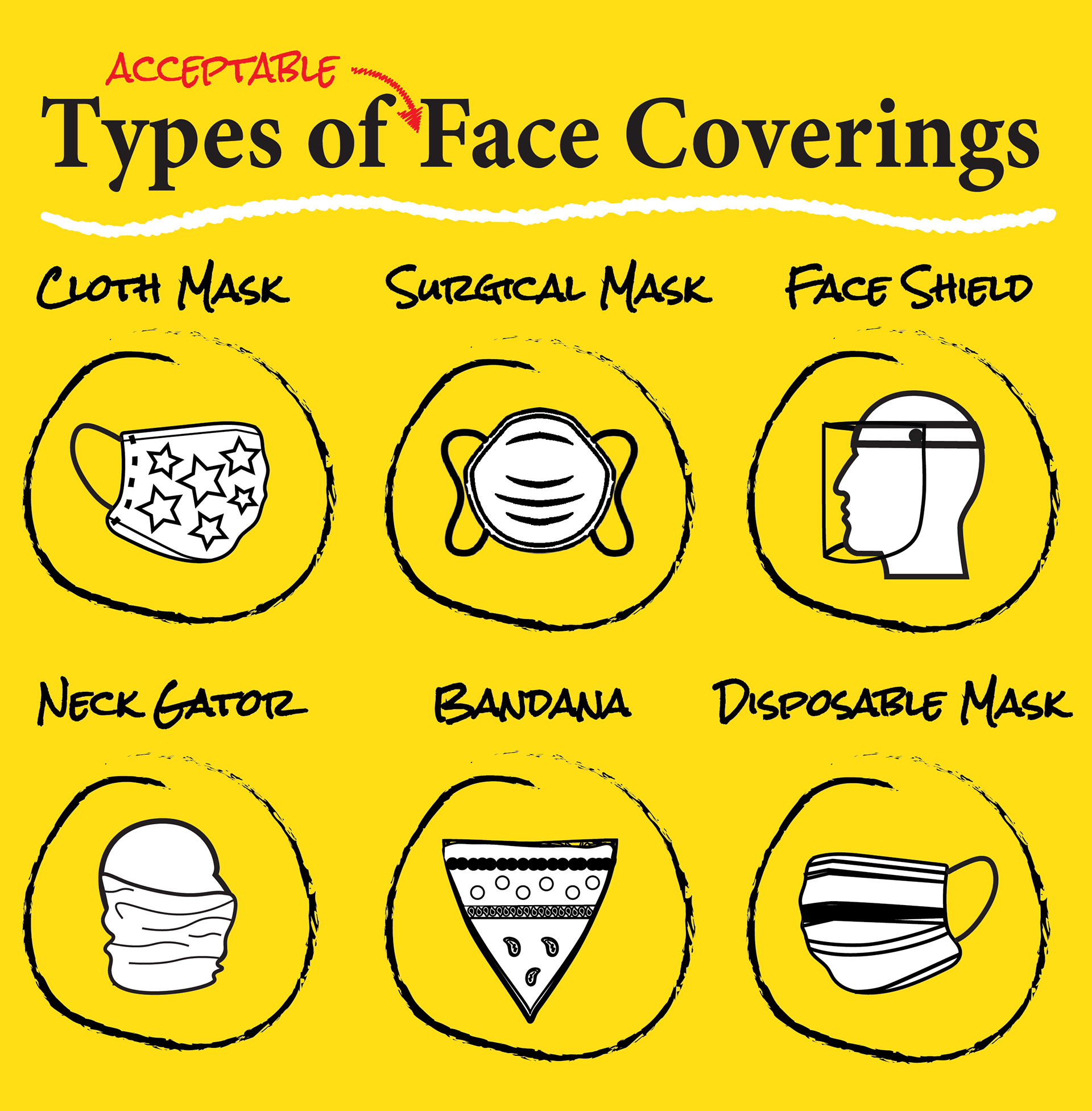
This graphic was made to incorporate acceptable usage of face coverings. However, the CDC changed this information after this graphic was designed.
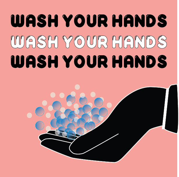
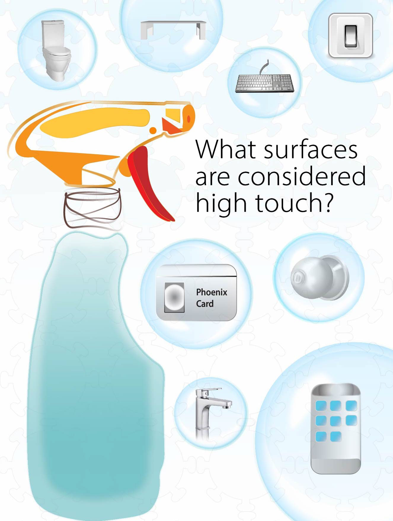

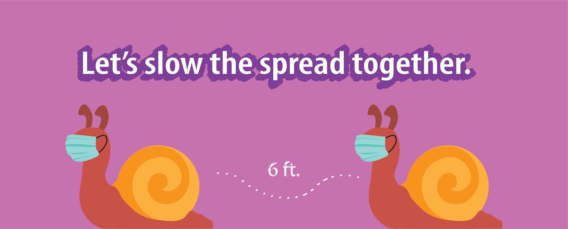
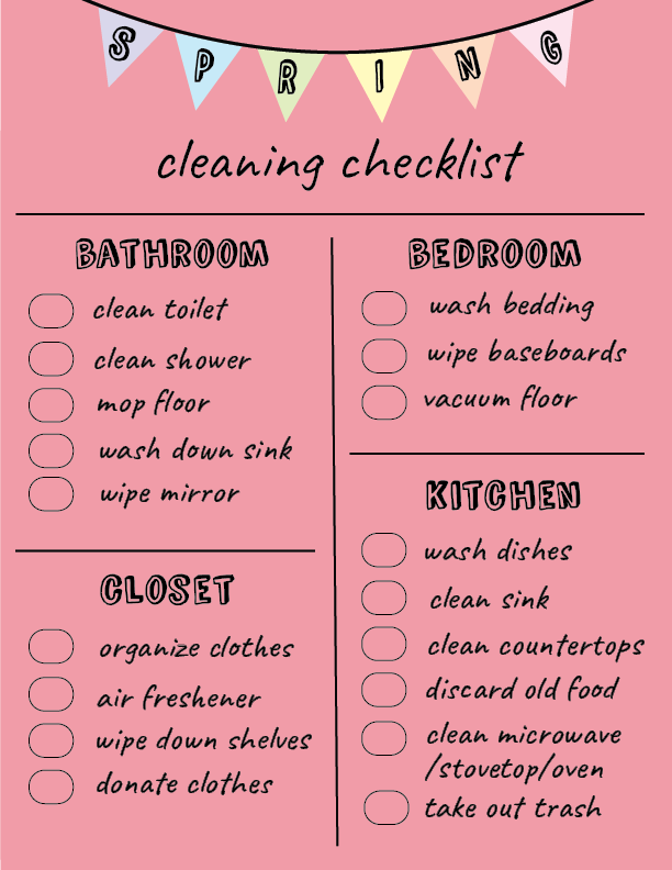
After many internship opportunities were cancelled due to the pandemic last summer, I was fortunate to intern for Elon University Physical Plant's social media team as a part of Elon's pilot E-works division for students. Throughout my internship, I designed graphics using Adobe Illustrator to highlight important information about Elon's efforts to slow the spread of COVID-19 prior to returning to in-person instruction in the fall.
Physical Plant runs most of the operations on Elon's campus– including landscaping and maintenance among countless other departments. Besides COVID-19, graphics, I designed graphic content for scheduled outages and holidays on campus throughout the year.
These graphics were created for a year-long social media plan that was scheduled for Physical Plant's social media during July 2020.



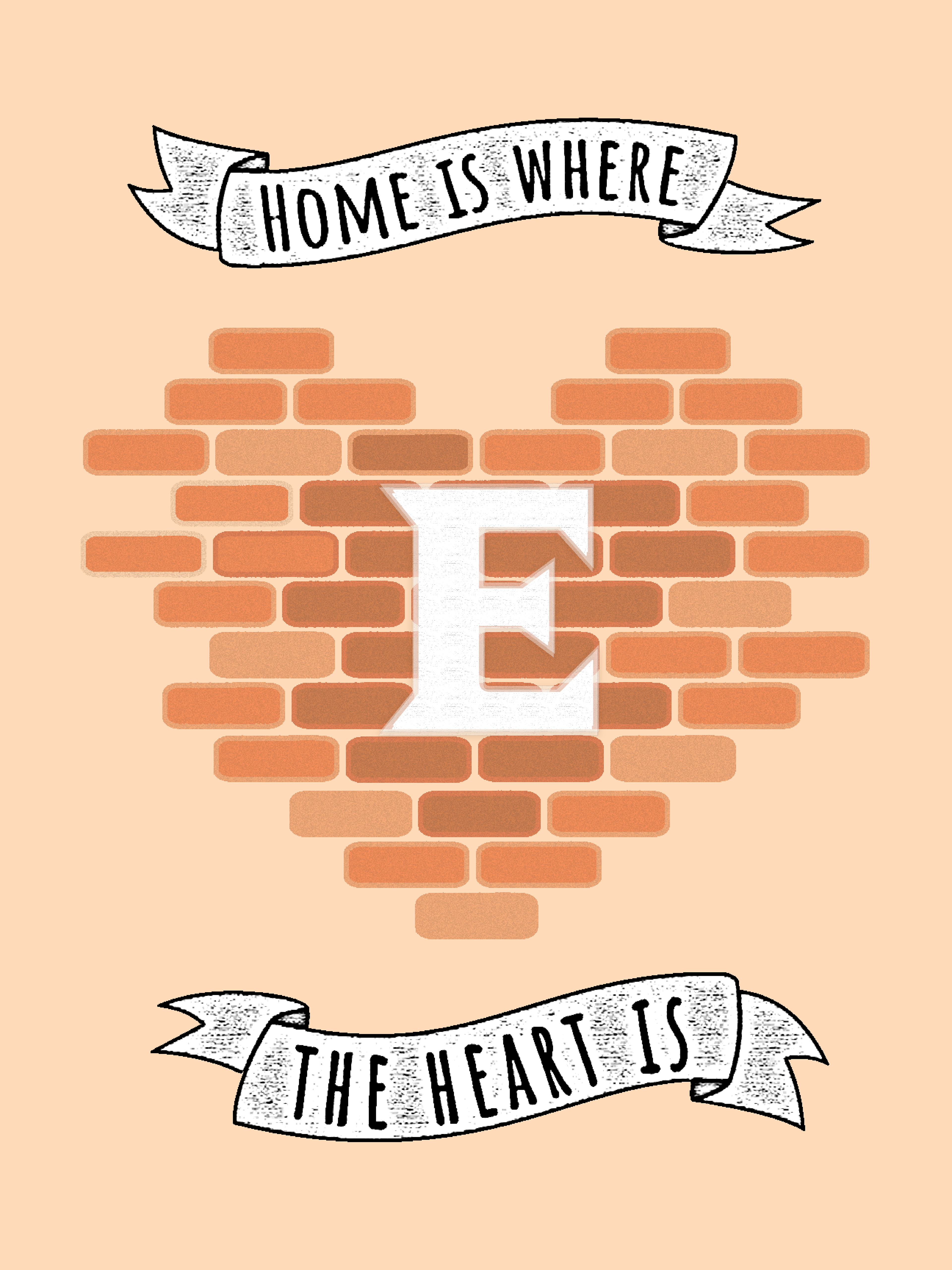
Elon Homecoming
Other Work
Normally, I don't share work I do for my classes. However, this layout design was part of an in-class challenge for my Editing and Design Class, and I'm proud of how it turned out. For this assignment, we were told to transform a story with images into a magazine layout design.
Not only did I incorporate colors from the images throughout the spread, but I designed a heart to mimic a bullet in shattered glass. The story is heartbreaking, and I wanted readers to understand the feelings and emotions surrounding this piece.
Note: The story and images for this assignment were ONLY used for educational purposes. Source: LA Times
